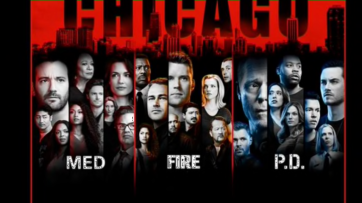
Chicago Fire, Chicago PD and Chicago Med return this month, so NBC has unveiled its promotional art for the upcoming One Chicago season.
With another One Chicago season coming up at the end of the month, NBC is revealing the promo art it will use to promote each one of the three shows this season—and it’s pretty different from what fans have seen in years past.
NBC made the decision to move two of the three shows to Wednesdays this fall in order to create a single themed programming block, and this season’s artwork is more focused on promoting that than the individual series themselves.
The promos for Chicago Fire season 7, Chicago PD season 6 and Chicago Med season 4 all use the exact same template. They feature character images on a black background, above a Chicago skyline.
All three pictures also use an identical tagline: “One City. One Family. One Night.” That speaks more to NBC’s arrangement of them on the schedule, rather than telling viewers anything about each of the shows.
More from One Chicago Center
- Chicago Med star on 2024 cast changes: ‘Nice to have new faces’
- Here’s the perfect Chicago Fire episode to watch on Thanksgiving
- Ranking the 8 NCIS Thanksgiving episodes from worst to best
- Mark Harmon does NOT have plans to reprise Gibbs on NCIS
- One Chicago stars tease new seasons on IG: ‘Here we come’
One thing that’s been carried over is that each show’s kept its own unique color that’s been used to identify it in the past—orange for Chicago Fire, blue for Chicago PD and red for Chicago Med.
But there’s no doubt that these pictures look very different from the graphics that you’ve been seeing for the last few years. And they might divide some fans.
Watch One Chicago on fuboTV: Watch over 67 live sports and entertainment channels with a 7-day FREE trial!
On one hand, one can’t blame NBC for putting the emphasis on the whole “Chicago Wednesdays” idea because that’s unique—there haven’t been three franchise shows regularly airing on the same night before.
CBS has done two in a row with their NCIS shows, but three is remarkable mostly because there are rarely franchises with three shows on simultaneously to even speak of.
On the other hand, there’s nothing unique about any of these posters anymore. The past ones have all had their own different styles to separate them from each other. They also popped with a lot more color (like last year’s Chicago Fire promo art that showed the cast on a background made of fire).
Black and minimalist is a lot more efficient, but it’s a lot less eye-catching, and any new or casual viewer looking at these won’t be able to glean much about any of the programs. You can guess the general premise based on the show titles, but there aren’t any cool taglines to make a viewer want to know more about them than just a firefighter, police or medical drama.
They definitely make a statement about the franchise’s new setup, though, and they’ll be the art that fans see throughout the season—from now until May.
Below is the Chicago Fire season 7 promo art, followed by the Chicago PD season 6 promo art and the Chicago Med season 4 promo art.
Look at all three images, then let us know what you think of this season’s artwork in the comments.


For the latest One Chicago spoilers and news on all three shows, stay connected to One Chicago Center throughout the new season.
